Rentalcars.com
Responsive design system
Rentalcars.com is an international market leader in car rental. The website was in the process of being updated to feature one responsive code base and I contributed to the design of its new booking service.
This project involved developing a new responsive design system that could be implemented on one code base that catered for both mobile and web customers.
The process involved:
Coordinating with their product management team to gather requirements and analyse their existing product performance.
Leading new product discovery. I worked together with insight analysts to identify user segments and used a range of research to identify their key customer needs.
Researching and validating all concepts. I conducted both remote and lab testing sessions with a range of research methods to validate any new hypothesis.
Working as part of an engineering team to provide design and usability direction throughout the development of a shared design system.
I worked closely with software and test engineers to provide guidance on front-end development; joining development mobs to use my knowledge of html and css to ensure we achieve a high quality end result.
Identifying problem areas
through research
The legacy product had two separate mobile and desktop websites. This not only doubled the amount of engineering focus and work, but also created a jarring, inconsistent experience for customers. The brief involved designing a shared design language that catered for all device sizes, whilst also assessing existing customer journeys to see where improvements were needed.
Initially, I completed a heuristic evaluation of the existing website to highlight any usability concerns and worked with a team of designers to collate all varying design components. We assessed the results of past A/B tests, analysed performance metrics and identified a range of customer pain points through lab-testing. To create a baseline from which to compare any new experiments, I ran a number of usability testing sessions with customers. It was vitally important to understand how customers used the existing product and helped to identify problem areas such as:
The mobile product performed poorly against its desktop counterpart.
We suspected that this was due to an overwhelming amount of information in a limited viewport, leading to a complex mobile experience.Features such as search and map view had been poorly considered for mobile users and neglected to use any native device controls, causing bugs across a number of device sizes.
We had access to a range of secondary research sources to help analyse the existing website usage data. Similarly, a post-booking NPS survey suggested how many customers would recommend the service and allowed us to gather a range of qualitative data.
Ideation and design process
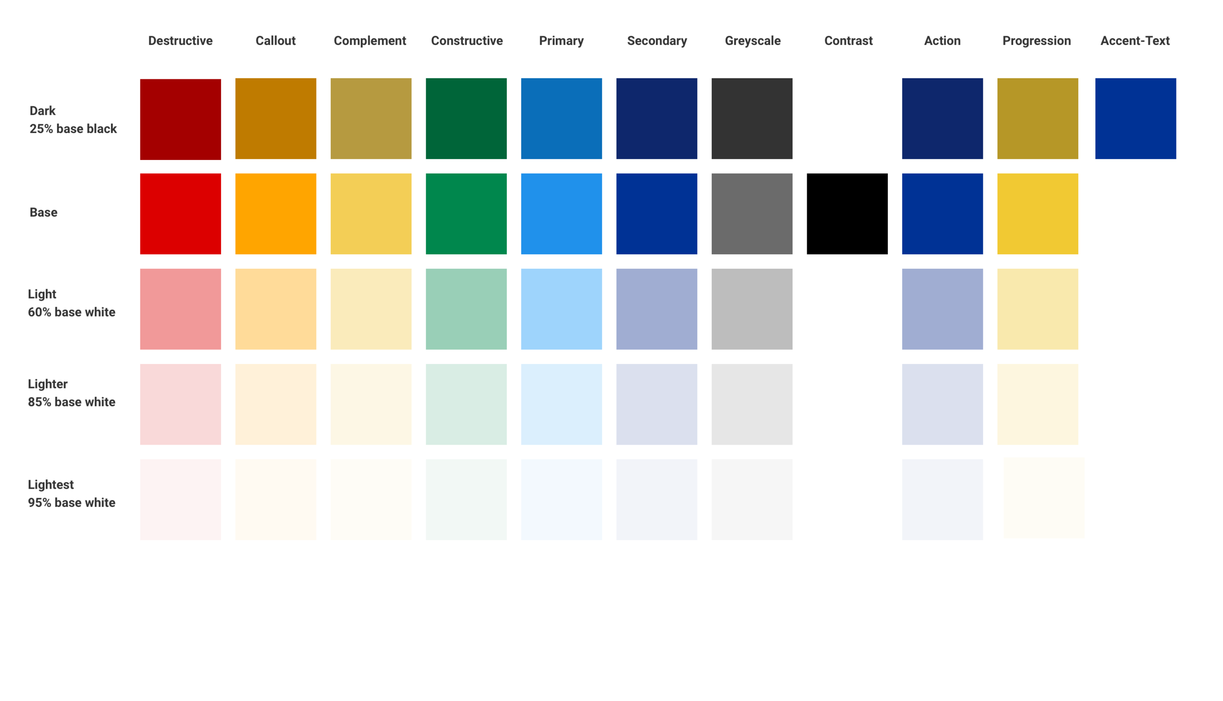
The foundations of a design system requires base rules that outline elements such as the colour palette, typography use cases, grid/sizing and any global patterns such as footers, headers or navigational elements.
Some of these rules already existed within the Rentalcars branding and others needed refining to ensure they were suitable for a responsive code base.
Once these foundations have been established, it is possible to theme all other components - however this does require a period of testing and refinement.
The process
Admittedly, this is a hard process to explain in written text and is catered to each project. This particular brief was very extensive, with us essentially starting from scratch to review, analyse, redesign and test a large amount of components so that they could be rebuilt by software engineers.
However, at a high level my design process involves:
Outlining the website structure and various possible user journeys.
I use this to visualise the entire process and analyse how successful it is at satisfying customer needs.
Establishing the core design rules and ‘system’ that all other elements will stem from.
Discussed above. This helps establish consistency across a service and leads to simple, clear designs.
Creating mood boards to outline imagery, illustrations, visual aids or language.
Despite this relating to a number of other design areas such as brand and marketing, it helps to paint a picture of a service.
All of these elements affect a user experience and perception of a product, so it’s important to be on the right page.
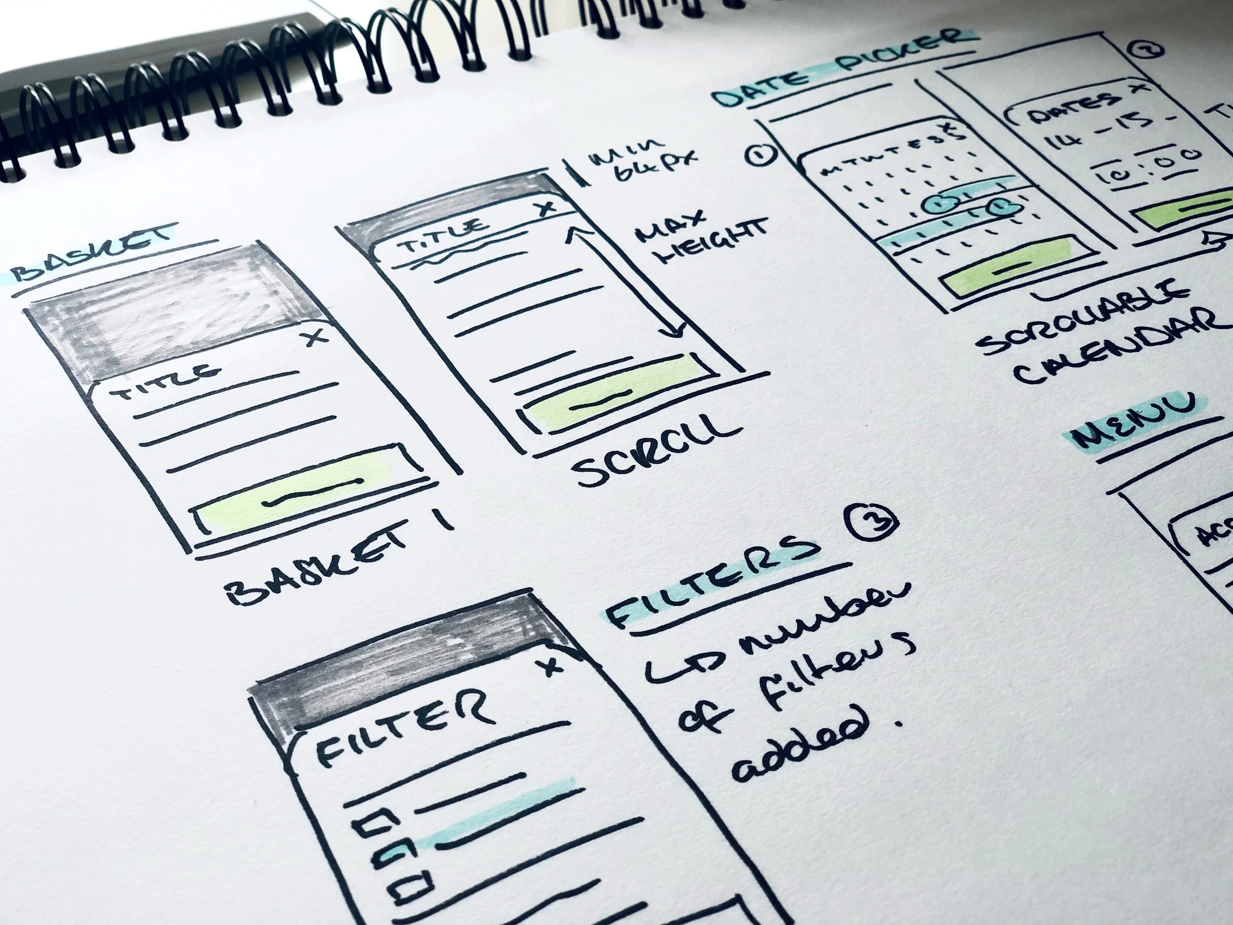
Drawing mock-ups of components, features or entire webpages.
This is a great starting point to discuss ideas or design concepts. They can also be used to start testing ideas on other people and customers.
Validating concepts
In order to test the usability of the new design system and flow, I conducted a range of online and in-lab studies to observe customers using each component.
I like to conduct this part of the process as early as possible to test the strength of ideas, so I will often use low fidelity wireframes and prototypes to get customers using a new feature.
Test, test, test
For this particular case study, I used both moderated lab studies and Userzoom to analyse the visual strength and clarity of each component - using methods such as navigation tasks, recall and click tests to ensure customers could effectively understand each feature.
Refine
In addition to this, any amendments made to the end-end customer journey were tested during navigation tasks. We invited 15 participants to take part in moderated lab studies where they were asked to complete a range of tasks, including making a booking and amendment. We used the feedback given throughout these tests to conduct design refinement, before beginning to launch on site A/B tests of certain features.
Experiment
Using the strategy of launching an mvp to customers, we were able to assess the impact of each layer of change for our customers. We were able to compare these changes with a baseline of the old website and could begin to A/B test the features that we had designed.
Minimum viable product (mvp) is a product development term used to describe the minimum amount of work required to provide value to customers, whilst still offering insight to the teams that have developed the product. We should always be learning from the work we do and assessing the impact of what we launch to customers - therefore, slicing work into small, manageable and clear increments allows us to observe the success of what we have designed or built.
The result
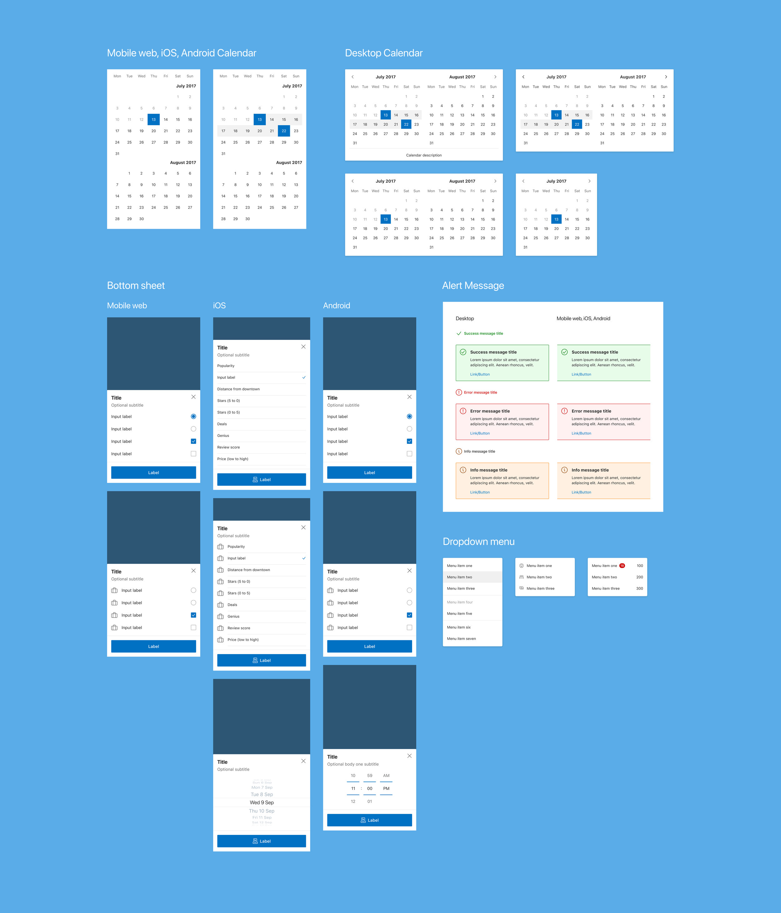
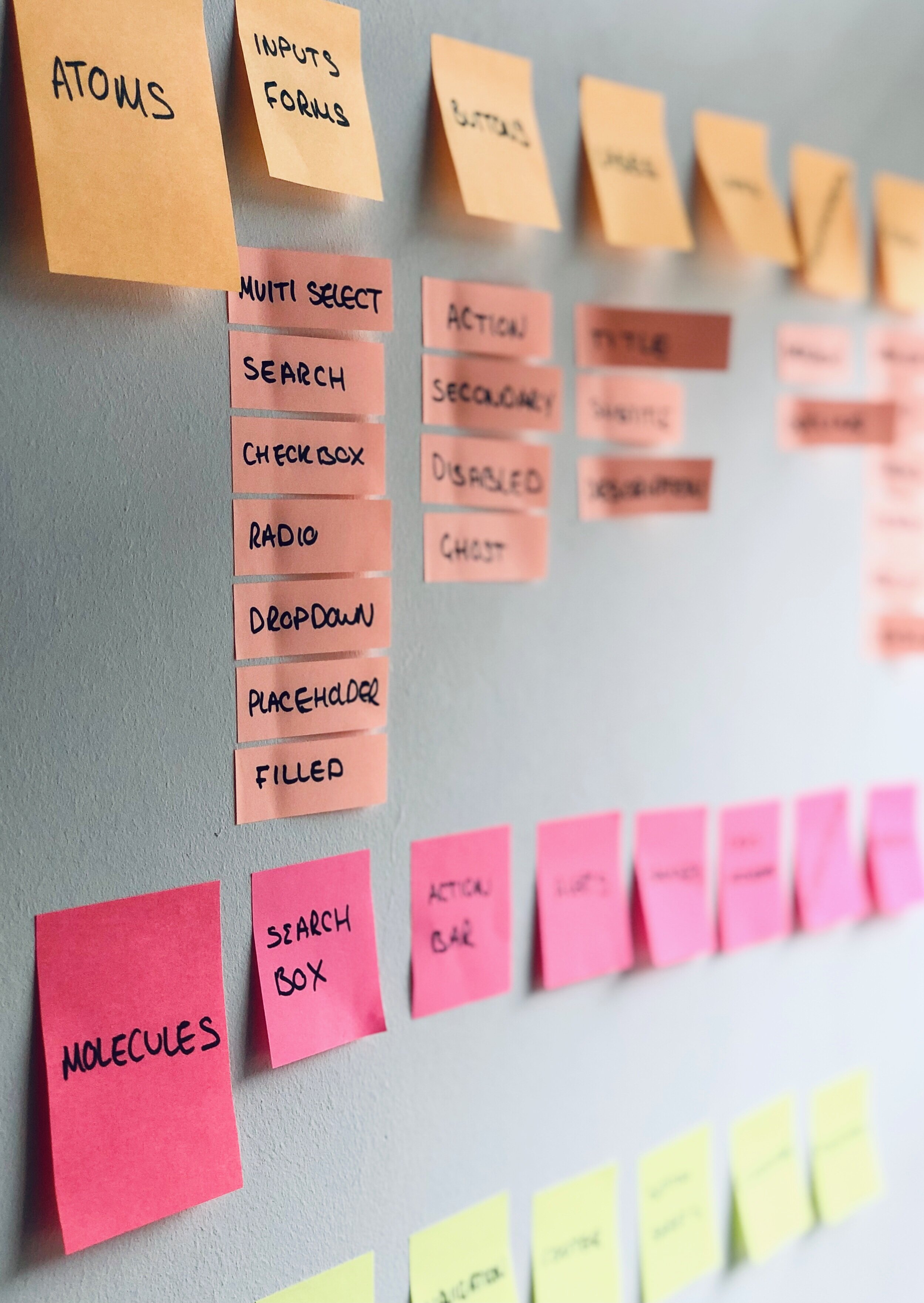
An atomic design system; a toolkit for the wider design community.
The substantial design system existed in both Figma libraries and the corresponding code which was developed by our team engineers.
The resulting design system was built to be scalable and theme-able. This was an important requirement that allowed it to be shared across multiple partner affiliated brands.
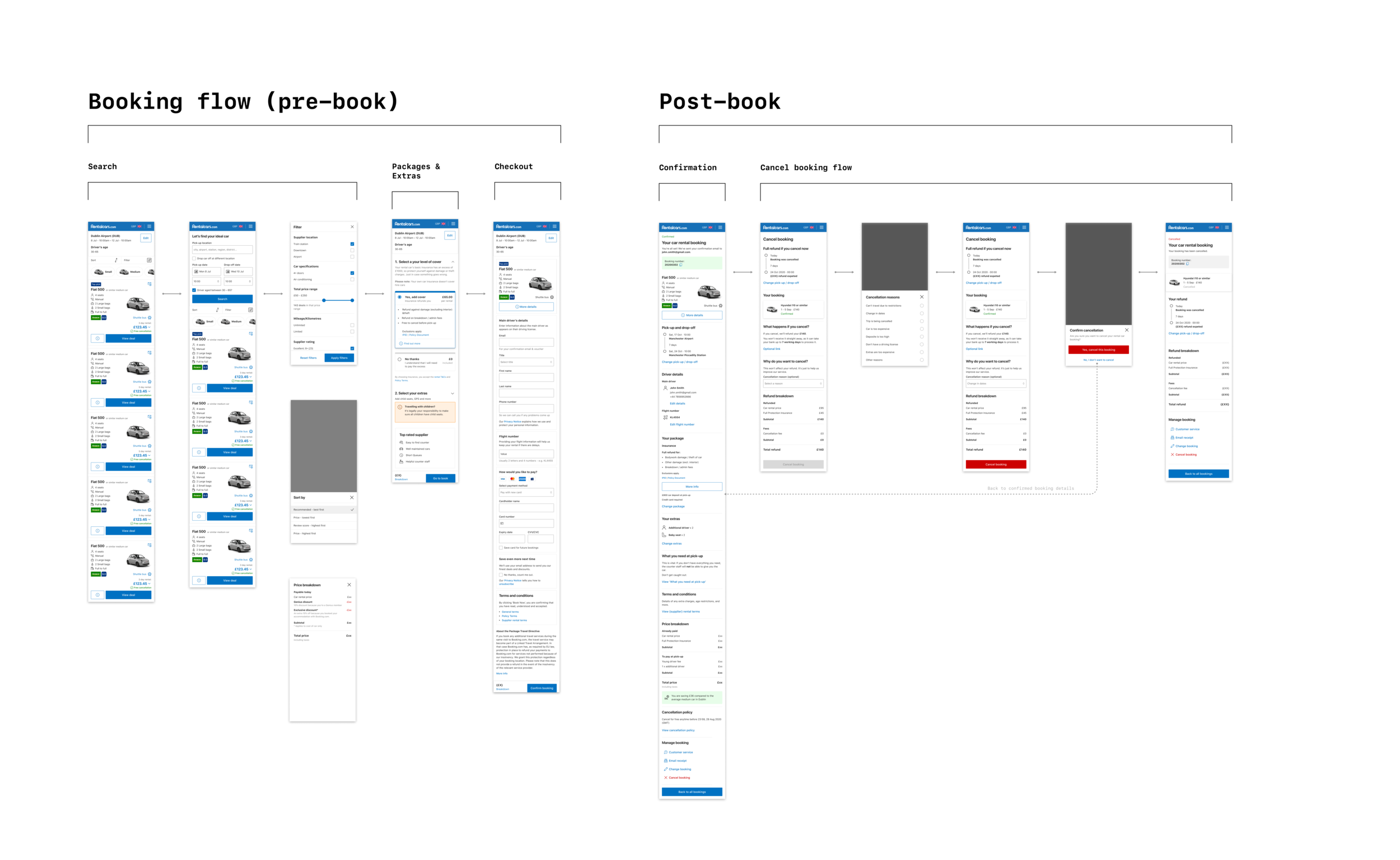
A fully responsive website
Where customer needs and usability requirements were catered for from mobile to desktop.
A number of improved features that were redesigned in the process
Such as a full-text search engine, dynamic filtering options and save quote functionality.
