Booking.com
Booking.com offers customers everything they need for brilliant travel experiences.
As a Senior UX designer, I played a key role on several cross-functional agile teams., collaborating closely with product managers, developers, and data analysts to create user-centric solutions that elevated the customer booking journey. My work involved conducting user research, designing intuitive interfaces, and continuously iterating based on user feedback and A/B experiments.
My responsibilities included:
Coordinating with product management across the organisation to gather requirements and analyse existing product performance to define areas for improvement and optimisation.
Leading new product discovery. I worked together with insight analysts to understand our audience, identify user segments and conduct a range of research to identify key customer needs.
I was responsible for the product design of the core booking journey, relying on user testing and A/B experiments to optimise the experience.
Researching and validating all concepts. I conducted both remote and lab testing sessions and a range of research methods to validate any new hypothesis.
Working as part of an engineering team to provide design and usability direction throughout the development process.
Identifying problem areas
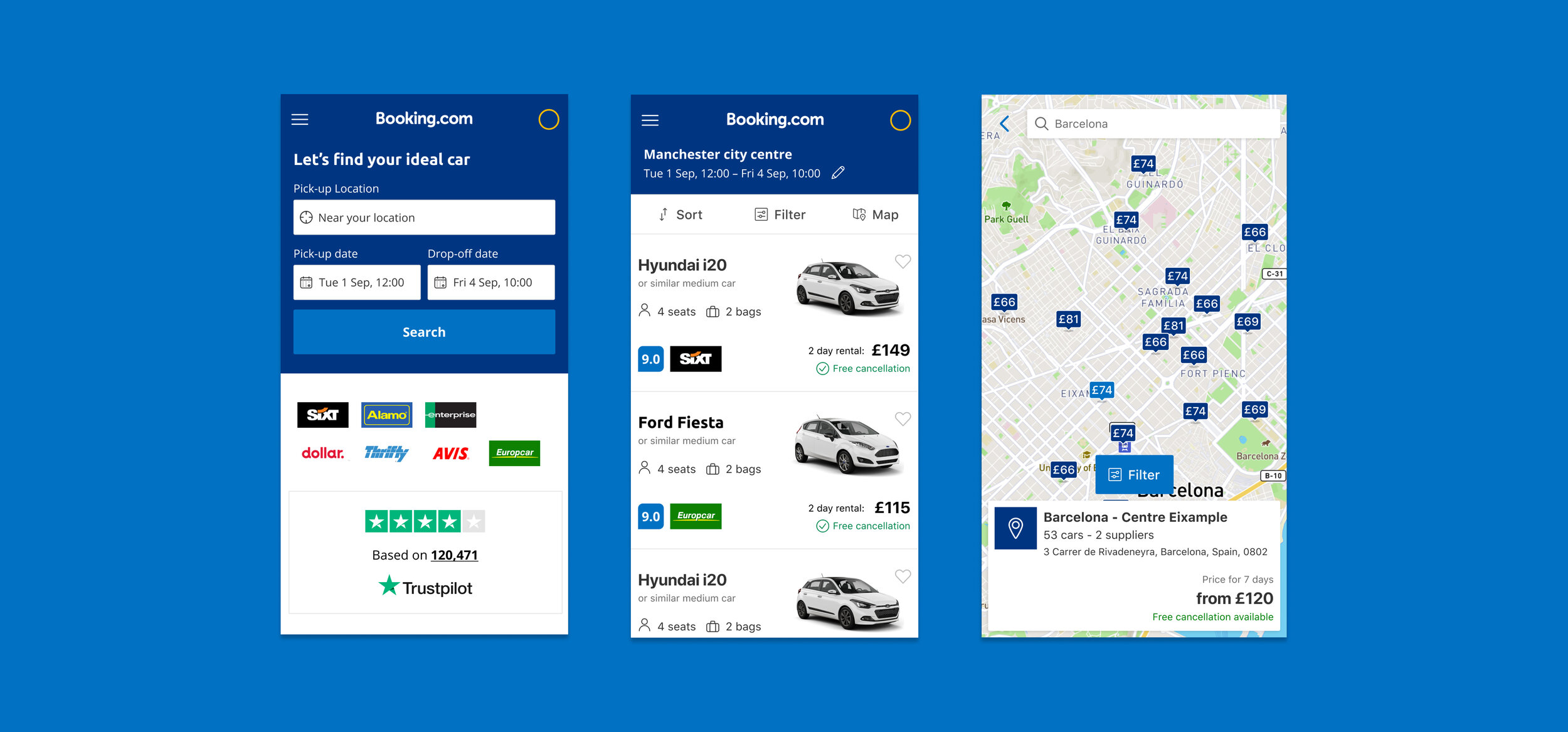
The existing platform was a complex, outdated search engine that focused primarily on customers who book car rentals at airports when travelling on holiday.
Despite 60% of customers searching for a city-based location we offered very few features to help customers find the right rental deal for them. This meant that many customers seeking car rentals in city locations dropped off the service and rarely converted to a booking.
Gathering quantitative data
Working alongside our customer insight analysts, we used live data sources to analyse how customers were using the product. Similarly, using the tool Clicktale I was able to watch videos and gather heat maps to analyse interaction behaviour.
This information allowed us to start hypothesizing about how customers were using the website and identify any customer pain points.
Research process
In addition to the analysis of onsite data, I also conducted a competitor analysis report - with the likes of Uber, Lyft and a range of public transport options, competition for travel within cities is strong. Understanding the market was crucial to gaining a picture of the task at hand.
Alongside performance data, I also conducted a full heuristic evaluation and UX review of our existing product to highlight areas for improvement.
Gathering qualitative data
To understand customer demographics and gather evidence to support our hypothesis, I surveyed a range of participants using Usabilla to launch onsite surveys, asking questions regarding:
The number of passengers and purpose of the rental trip to understand the demographics of customers.
Whether customers were travelling somewhere new or local.
What information was most important to customers when deciding upon a rental.
How far customers were willing to travel and what impact price had on this decision.
Once we had gained a holistic picture of the product area we had enough evidence to write a number of hypotheses to guide our investigation:
Hypothesis
Customers in city locations are shown a search area that is too wide, creating an overwhelming amount of choice that is irrelevant to them.
The high cost of city based rentals makes them uncompetitative against cheaper airport deals that have more availability.
Our product features prioritise airport locations due to availability and price, causing a high amount of ‘no results’ in city locations.
We suspected that these problems meant that customers were unable to find affordable and accessible rental deals in their desired location and were therefore choosing to book elsewhere.
Identifying opportunities
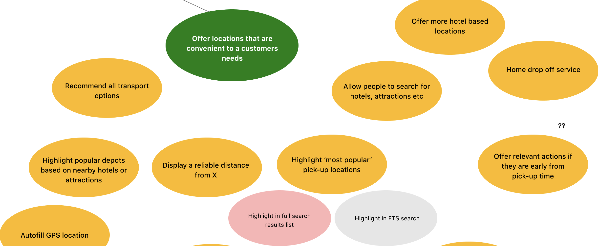
We were able to use the hypothesis to write ‘how might we…’ statements, such as:
‘How might we help customers find results that are more relevant to their search location?’
Having a clear statement or question enabled us to focus our problem solving and start generating ideas with stakeholders.
For this particular project, I used the ‘Opportunity Tree’ methodology to format ideas and help prioritise my workload. It is an organised way of cataloging possible solutions and helps me analyse the best course of action to take.
I regularly use this methodology to simplify a complex problem space and it aids my ability to present proposed solutions to stakeholders.
Generating ideas
Using the ‘How might we...’ statements generated through research, I organised a number of ideation sessions with stakeholders.
Ideas and new perspectives can come from many sources and I find having open discussions extremely helpful when thinking outside of the box.

Design process
The process of refining designs is never linear and involves constant analysis, discussion and testing to establish the end result.
Establishing a clear UX flow and information hierarchy.
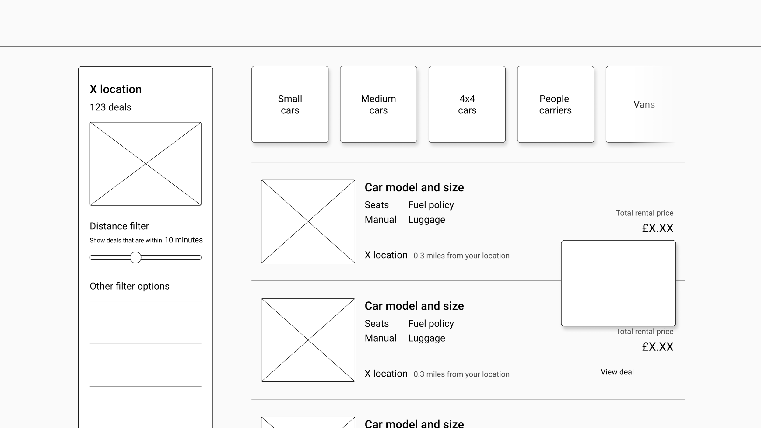
Mocking up low fidelity wireframes to communicate initial concepts.
Using the correct visual language and design system to create iterations.
A period of refinement and validation following user testing.
Validating concepts
In order to determine the validity of new ideas, I conducted a range of studies to put them into practise. This consisted of both online and in-lab testing to observe customer perceptions of a particular idea.
I like to conduct this part of the process as early as possible to test the strength of ideas, so I will often use low fidelity wireframes and prototypes to get customers using a new feature.
Test, test, test
For this particular case study, I used Userzoom to test initial concepts on specific target markets. The studies ranged from basic click tests to analyse the visual strength of a design and card sorts to help determine information hierarchy to more extensive navigation tasks to test the usability of a new feature.
Refine
I used the feedback given throughout these tests to conduct a period of design refinement. The refined designs were then tested in a formal lab study, where I joined a team of researchers to observe participants using a working prototype.
Experiment
In the latter stages of the project, we worked with our engineering teams to prioritise and build a number of features to conduct A/B testing.
The results of this testing validated a number of new improvements and fed into our backlog to ensure we were always improving.
The result
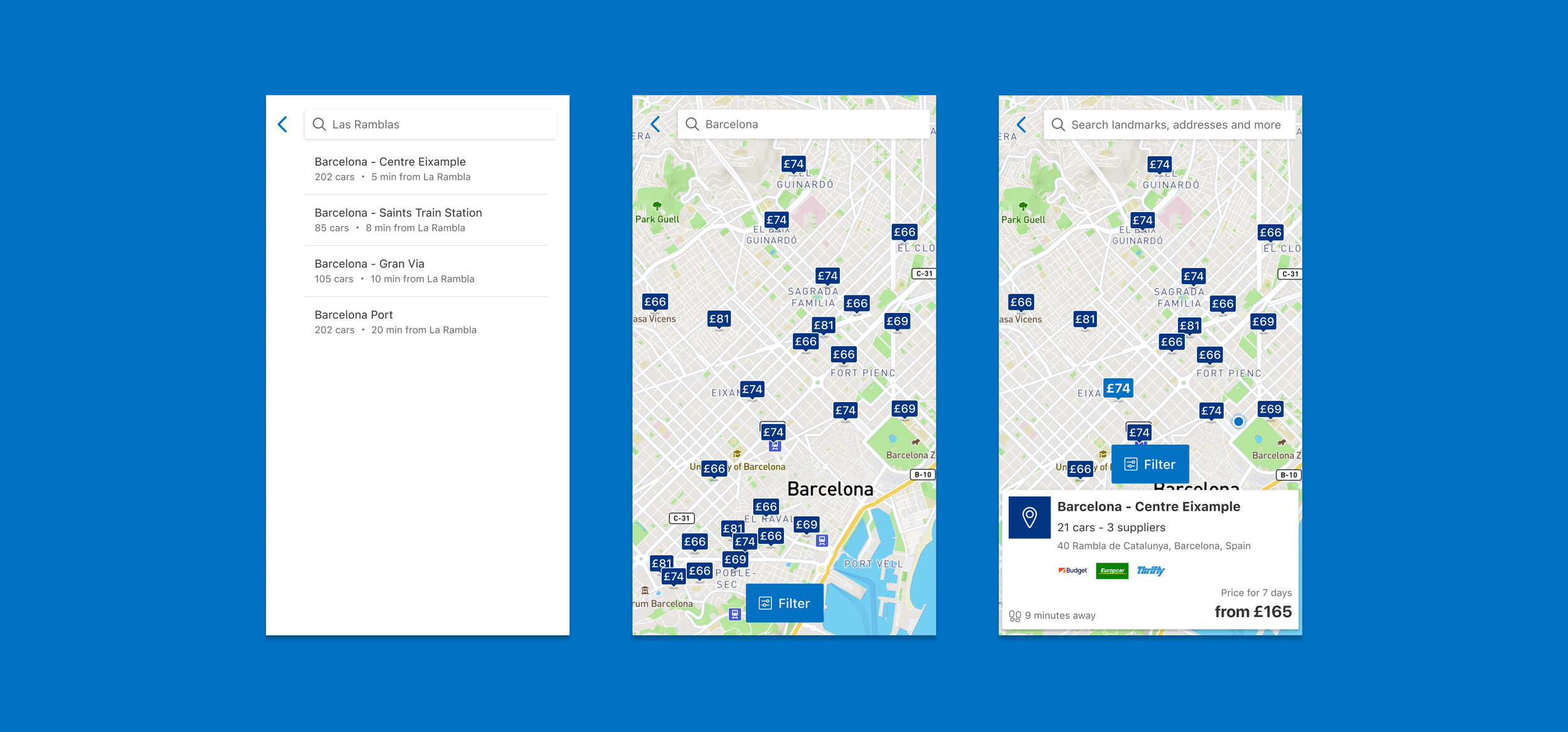
Improved map functionality to provide customers with a visual aid to help find inner city depots.
Features included GPS, in-map search and a city mapper direction tool to find the easiest way to get to a depot.
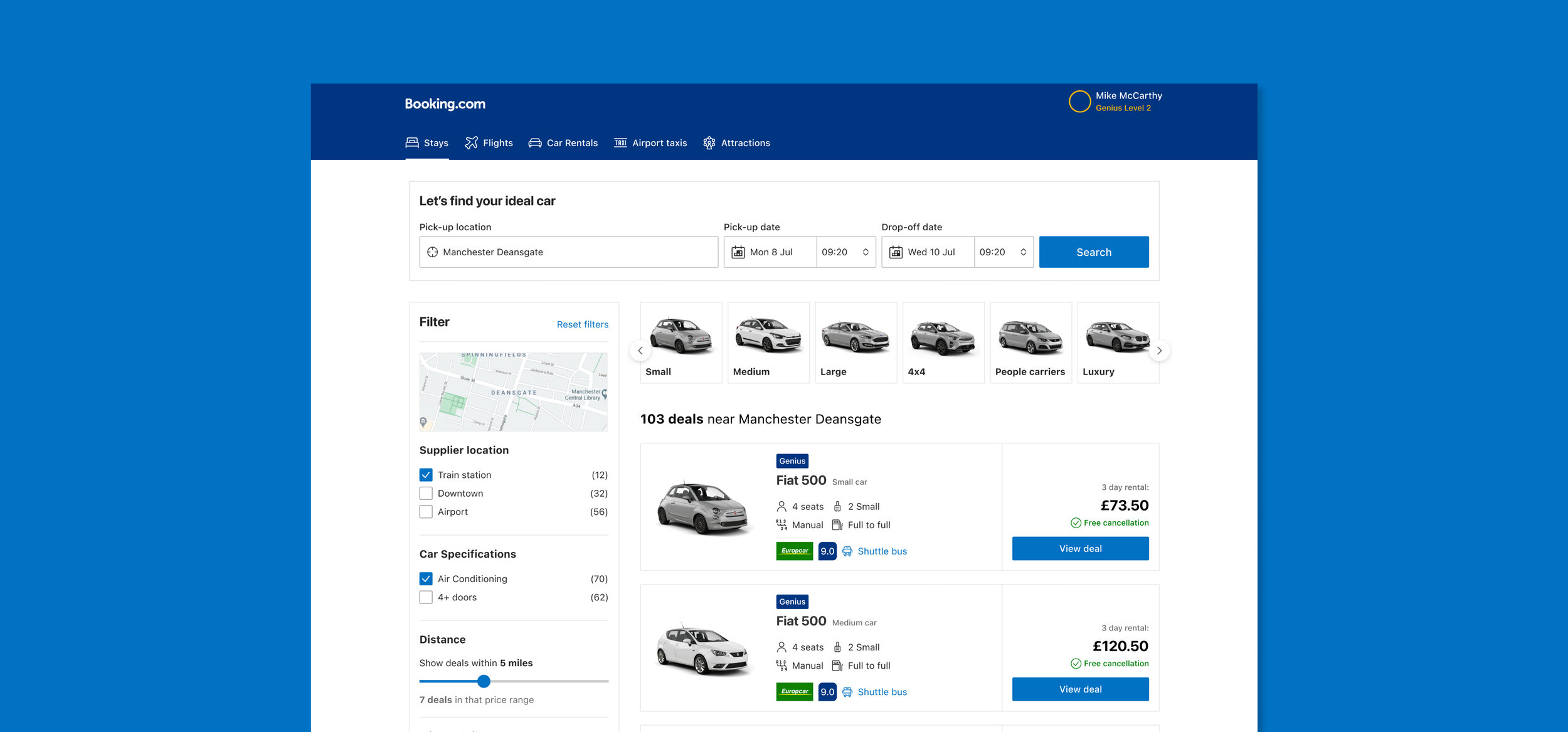
Clear onsite signposting to promote inner city locations and alleviate ‘no results’ scenarios.
This included adding contextual titles, the number of deals available and a number of features that helped refine results such as distance and price filtering options.
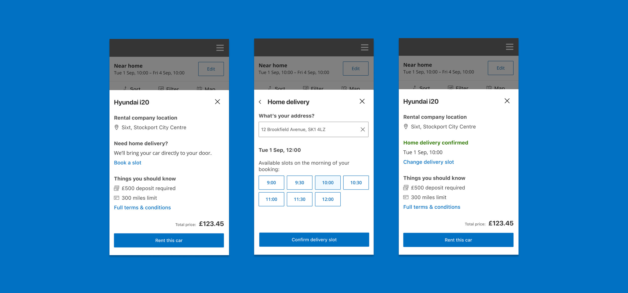
Inner city ‘Home drop-off’ service to provide a competitive advantage against cheaper airport deals.
